Free to Share and Print – High Res Links Below:
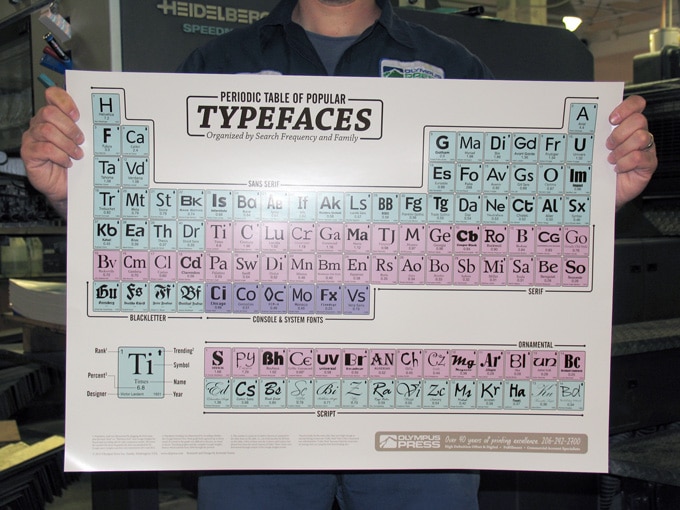
We are a commercial printer and we created this poster primarily as a free giveaway to our clients, but also for anyone else who might be interested in typefaces. The original was printed on 100lb gloss using our unique High Definition process on a 40″ Heidelberg CD 6 color press. The poster measures 28 inches wide by 20.5 inches tall.
If you would like to share the image above, feel free to copy, paste, and even print. Please be kind and link back to this post when possible! If you would like to print this yourself, use the PDF above. For all uses in web or print we require that you do not alter this piece from its original form, keeping all information intact.
For rights to any other use that may not be clear here, chances are we’ll say yes, but please contact us first at info@olypress.com
Periodic Table – medium jpg (1000px)
Periodic Table – large jpg (1600px)
Periodic Table – extra large jpg (2440px)
Notes from the Designer:
Typography seems to have become increasingly popular among designers, and the lay public, over the last ten years. Undoubtedly, this is related to the availability of thousands of typefaces via the internet. It was through an internet search for something typography-related that I stumbled upon Cam Wilde’s Periodic Table of Typefaces. While it was a beautiful combination of type and science (two of my loves!), I yearned for something that was organized more to my particular tastes. I also wondered if there was a way of ranking the typefaces in a less arbitrary manner.
In the summer of 2012 I began plugging typefaces into Google Insights for search (now merged with Google Trends). Google Insights allows users to see historic search-volume-over-time for specific terms. These terms can be viewed side by side in order to compare how often they have been searched for by Google’s billion-plus unique monthly searchers. By using this tool it was possible to create a less arbitrary ranking of typefaces by using mass popularity rather than opinion. There are some drawbacks to this method of ranking. Using popularity as a guide meant that this periodic table could not avoid such infamous giants like Papyrus (see this, and this.) and Impact. Nevertheless, popularity in and of itself is a revealing metric.
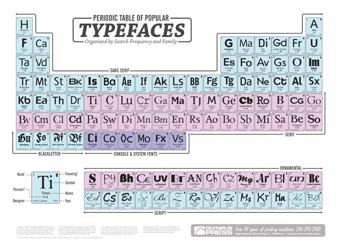
This Periodic Table of Popular Typefaces includes 110 typefaces neatly segregated by family and sequentially arranged by rank while still maintaining the traditional periodic table structure. In addition to the designer and the year produced, the table includes popularity trending and a number representing a percent of relative interest. Popularity rank (upper left number) was determined by plugging the typeface name plus the term “font,” i.e. “Helvetica font,” into Google Insights for Search and comparing side by side comparison results. This took a lot of searches and frequently resulted in being locked out of the tool for exceeding the number of daily queries that Google would allow. Through repeated searches comparing over 200 typefaces I was able to separate the popular from the not as popular. I then defined the family groups and weeded out over 100 popular typefaces that didn’t have enough interest to make the chart.
An important inclusion into a periodic table of elements is the atomic weight which is usually found under the name of the element. For aesthetics, I wanted to include a corresponding number on this Periodic Table of Popular Typefaces. To do this, I collected them in a spreadsheet and analyzed the normalized numbers provided by Google for each typeface. If we say the total search volume for all 110 typefaces is 100% of a whole, then through some simple math it was easy to determined what each typeface’s share of that whole was. For example, out of the total volume of searches for all 110 typefaces, 1.96% of those searches were for “Century font” and 0.52% were for “Didot font.” What this shows is that Century was searched for almost 4 times as much as Didot. And as no surprise, the mighty Helvetica came in with a whopping 7.2% share of the search volume for these 110 fonts.
Jeremiah Easter (2013)


